
The previous chapter in this MAUI adventure was all about the basics. We walked through the installation process, created a new MAUI application, looked at the different files inside said application, and set up an Android emulator. Nothing that exciting, right? Well, let’s change that a bit. In this second part, I will be demonstrating how you can create a homepage, which will be the start page, add some basic controls, and show data from a JSON file in a list.
This article is part of a series. I would highly recommend starting from the beginning and working your way through the articles. Especially if you are a beginner.
We are still working towards a whole, complete working application. The idea is to create a budget app that can help us keep track of expenses and income.
Goals Of This Article
The main goals are:
- Create a new content page
- Change the start page of the MAUI application
- Learn how to add a control in XAML to a page
- Learn basic styling in XAML
Table Of Contents
New Content
I love it when you open an app and the first thing you see is a dashboard that gives some sort of overview. I want to add this to my Expenser app. This will be the home page. We could re-use the MainPage.xaml for this, but that would be way too easy! Let’s create a whole new page!
Since we can use folders in our project, I am going to create a new folder in the MAUI app and call it Pages. I want to place all my pages here, hence the name.
Next, I am going to add the actual page to this folder. If you add a new item you will notice the .NET MAUI category in the Add New Item window. Clicking on this shows you all the templates available for MAUI.

C# VS XAML
There are two ContentPage types, two ContentViews types, and one ResourceDictionary. The most common one is the ContentPage, which serves as a page that is a single view. There is a C# and an XAML variant. The difference is that the C# variant allows you to create the whole page through C#. You can create all the components you usually see on a page with C#.
The XAML variant allows you to design the page with XAML, which we know from WPF and Xamarin… If you ever worked with that. XAML is an XML-based markup language.
Both the C# and the XAML variant have the same purpose: Define the user interface. But to be honest; I never saw someone use the C# variant, so I am not going to either.
Let’s select the .NET MAUI ContentPage (XAML) and give it the name “HomePage”. Click on Add.
Note! I will not be explaining XAML too much. Maybe some tips & tricks, but not an in-depth training. Maybe I will be adding some in the future if there are enough people asking for it. If you want to know more about XAML and want a tutorial about it, let me know in the comments
Changing Start Page
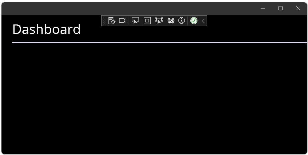
Before we are going to add some XAML to the page, we need to set the HomePage as the start-up page. If we start the app now the MainPage is showing
The first page you see is determined in the AppShell.xaml. Here you see a tag ShellContent, which has the attribute ContentTemplate. This attribute has the value of a template, which is a page. It is set to MainPage and we want HomePage. But changing MainPage to HomePage doesn’t work. Although you don’t see the famous red line under HomePage, you will get an error when you build the solution.

This is because the class/page AppShell has no idea where the HomePage class is located. In plain C#, we would add a using at the top of our C# file. But this isn’t C#. Instead, we need to add an XMLNS. I’ll explain in a minute. Change the XAML to this:
<?xml version="1.0" encoding="UTF-8" ?>
<Shell
    x:Class="Expenser.MAUIAppl.AppShell"
    xmlns="http://schemas.microsoft.com/dotnet/2021/maui"
    xmlns:x="http://schemas.microsoft.com/winfx/2009/xaml"
    xmlns:pages="clr-namespace:Expenser.MAUIAppl.Pages"
    Shell.FlyoutBehavior="Disabled">

    <ShellContent
        Title="Home"
        ContentTemplate="{DataTemplate pages:HomePage}"
        Route="MainPage" />

</Shell>
You can now build and run the application. You will see that HomePage is now showing instead of the MainPage.
XMLNS Explained
XMLNS stands for XML namespace and can be used to import other classes like we just did with the HomePage, which is located in the Pages-folder. I have defined a new XML namespace with the prefix local. You can see this as a way to prevent name conflicts and you can pinpoint specific classes.
CLR stands for Common Language Runtime and has a lot of functions we had to manage before the CLR came along. Think about managing memory, exception handling, garbage collection performances, and it provides other essential services for running the .NET framework.
If you combine it all you have an import of a .NET namespace that is being initialized and you can use the public properties, public methods, or the whole class inside the XAML page.
Page Title
Let’s add something simple to the HomePage: A page label. Just something so we can see on what page we are. I want to end up with something like this:
Pretty simple: A label with a line under it. To accomplish this I will be using some XAML and styling. Nothing fancy. For XAML I will be using a VirtualStackLayout, a Label, and a BoxView. Styling will be done in a ContentPage.Resources.
VerticalStackLayout
Layouts are important in XAML. They define the way you build up your page. There are several ways to define your layout. You can use a grid, StackLayout, canvas, and the VerticalStackLayout. They all have different benefits. The VerticalStackLayout allows you to stack elements on top of each other and that is just what I want to achieve.
The VerticalStackLayout looks like this in XAML:
<VerticalStackLayout>
...
</VerticalStackLayout>
Like most elements, you can add attributes to an element. Not all the attributes are the same and some elements have attributes others don’t have.
Some Space
But one that is pretty common is the margin. If you have done some HTML and CSS, you know the margin and the padding. And I don’t know about you, but I always mix them up. The margin is the space between the element and the next element. The padding is the space between the element’s border and its content.
And while we are on the subject, in CSS the margin is set for all borders, sides, and top, or all sides set individually. In the case of the last one, the setting goes from top to right to bottom to left. In XAML it’s different. You start at the left side and work your way clockwise.
Why am I talking about margin? Well, I want to have some space between the top side of the window and the label with the line. Adding a margin to any element is pretty easy. Just set the margin attribute and give it some value. For our VerticalStackLayout it looks like this:
<VerticalStackLayout Margin="0,10,0,0">
...
</VerticalStackLayout>
I have now created 10 pixels of space between the top of the VerticalStackLayout and the coming elements. But nothing is showing yet, because the VerticalStackLayout does not have any visual representation.
A Label
I want a label on top of that line. For these two I will be using a label and a BoxView. A label is nothing more than some plain text. We can set up the design of the text, but I will come to that later.
The label has an attribute Text which sets the text that is visible in the application when you run it. There are more attributes, but let’s keep it simple.
Hint: If you want to see all the properties, or attributes, of an element, simply click on the XAML element and press F4 (Properties window). Now you will see everything you can set, change, and design for that specific element.
I want to show the text Dashboard in the label, so I add a Label element to the VerticalStackLayout like this:
<VerticalStackLayout Margin="0,10,0,0">
    <Label Text="Dashboard"/>
</VerticalStackLayout>
Awesome! Let’s start the application and see what it looks like.
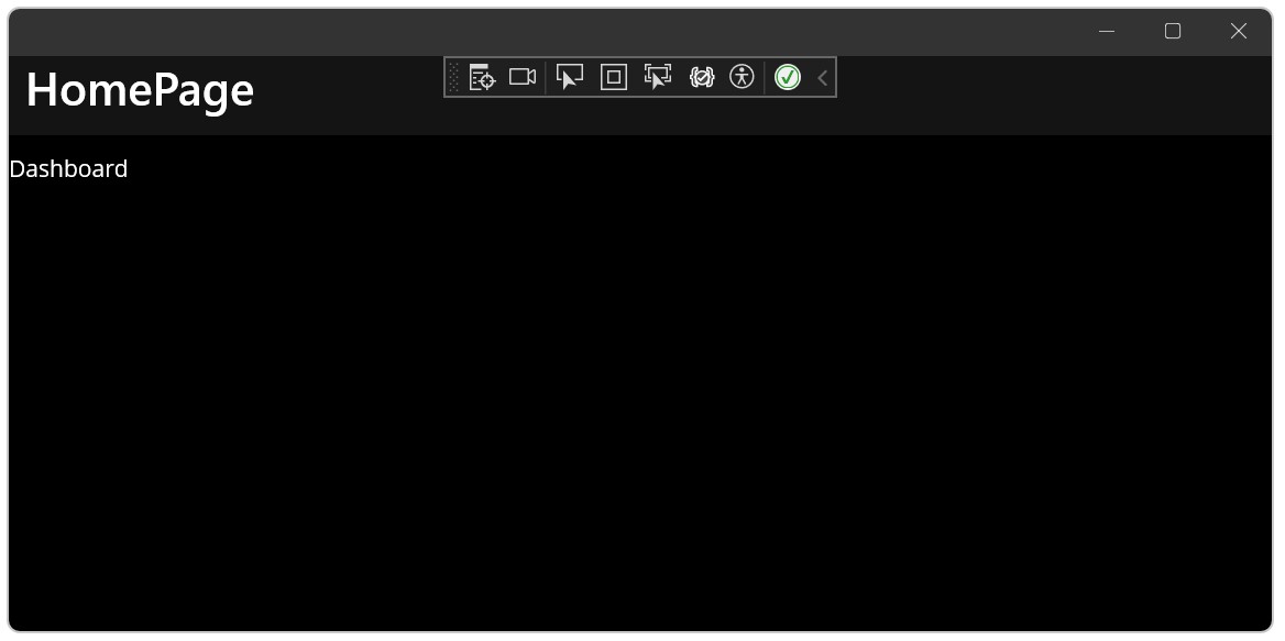
Well, it’s a start but not quite what I had in mind. But it’s a start, right?
Drawing The Line
We continue to add another element: The BoxView. This one is perfect for drawing a horizontal line. You won’t see much at first because it needs some style, like length and color. But we will come to that in the next chapter.
The BoxView is like the name says: A box. You can make it a square or a rectangle. I want to position this element 10 pixels under the label ‘Dashboard’, so I add a margin to it with 10 pixels from the top.
<VerticalStackLayout Margin="0,10,0,0">
    <Label Text="Dashboard"/>
    <BoxView Margin="0,10,0,0"/>
</VerticalStackLayout>
When you run the application you will see no line. Let’s change that.
Basic Styling
There are multiple ways to define and use styles. Some styles can be applied to an element directly through attributes. But you can also define more complex styles by using a Style element. Style elements are placed inside the page. We start by creating a style in the page itself or in XAML files, like the Styles.xaml (located in the Resources\Styles).
If you have an element that you want to style and only apply that style for that element on that page, there is no need to place the style in Styles.xaml. The Styles.xaml is a file that has styles that can be applied to all pages.
Dark VS Light
Your app has two themes, well three if you count the default. There is the dark theme, which is the colors you see in my screenshots because I have set my Windows to the dark theme. And then there is Light. This one is bright and a lot of white.
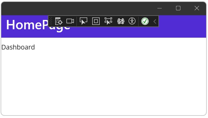
Above is the difference between dark and light. I did not change any colors, I only switched themes.
You can change to the light theme (or to the dark theme) by changing your Windows settings. But you can also fix it by code. Simply open the App.xaml.cs and add the following line:
public App()
{
	InitializeComponent();

	Application.Current.UserAppTheme = AppTheme.Dark; // Or AppTheme.Light

	MainPage = new AppShell();
}
Colors.xaml
This file, located in the Resources\Styles, has predefined colors. You can change them if you want. These colors define the theme colors, but you will learn you can change these per element.
Let’s add a new color for the headers. Since we are going to create multiple pages, with each a header, it’s wise to create one color to rule them all.
Add the following colors to the Colors.xaml, below the last Color element, and above the first SolidColorBrush:
<Color x:Key="Header1">#313131</Color>
<Color x:Key="Header2">#dedede</Color>
I will be coming back on these later.
ContentPage Style
The first thing we want to do is add a new element: ContentPage.Resources. This element can have the styles per element and here you can add a style for a label, for example. ContentPage.Resources are placed at the top, just below the ContentPage element.
<ContentPage xmlns="http://schemas.microsoft.com/dotnet/2021/maui"
             xmlns:x="http://schemas.microsoft.com/winfx/2009/xaml"
             x:Class="Expenser.MAUIAppl.Pages.HomePage"
             Title="HomePage">

    <ContentPage.Resources>
        ...
    </ContentPage.Resources>

    ...
</ContentPage>
Styles go inside this ContentPage.Resources.
Label Style
I want to make the font size of the label a bit bigger. Let’s say 30 pixels. This way we create a nice header. To make this happen we need to add a Style element to the ContentPage.Resources. A Style element has:
- Attribute TargetType
Which tells XAML which elements the style is applicable for. - Attribute Key
Can be compared to an ID in HTML and CSS. This way you can use the style for specific elements that have that same key. - Element Setter(s)
A setter has a property (the name of the style you want to change) and a value (the value of said property).
I want to change the font size of a label, so I add a Style with the TargetType Label:
<ContentPage xmlns="http://schemas.microsoft.com/dotnet/2021/maui"
             xmlns:x="http://schemas.microsoft.com/winfx/2009/xaml"
             x:Class="Expenser.MAUIAppl.Pages.HomePage"
             Title="HomePage">

    <ContentPage.Resources>
        <Style TargetType="Label">

        </Style>
    </ContentPage.Resources>

    ...
</ContentPage>
This doesn’t do anything, yet. Let’s add the property FontSize and set the value to 30:
<ContentPage xmlns="http://schemas.microsoft.com/dotnet/2021/maui"
             xmlns:x="http://schemas.microsoft.com/winfx/2009/xaml"
             x:Class="Expenser.MAUIAppl.Pages.HomePage"
             Title="HomePage">

    <ContentPage.Resources>
        <Style TargetType="Label">
            <Setter Property="FontSize" Value="30" />
        </Style>
    </ContentPage.Resources>

    ...
</ContentPage>
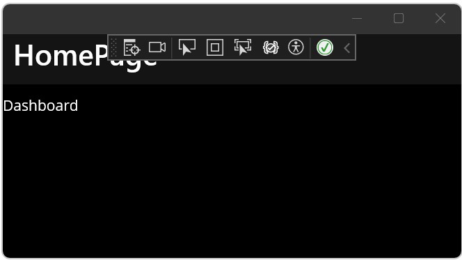
Awesome! That’s it! Let’s start the application and see what happens.
That looks a lot better! Let’s look at the BoxView next.
BoxView Style
The BoxView needs different setters. We need to set the color of the element, for which we will use the predefined Secondary. And we will set the height of the box, which will be 2 pixels.
I’ll show you the XAML first, then discuss the new elements:
<ContentPage xmlns="http://schemas.microsoft.com/dotnet/2021/maui"
             xmlns:x="http://schemas.microsoft.com/winfx/2009/xaml"
             x:Class="Expenser.MAUIAppl.Pages.HomePage"
             Title="HomePage">

    <ContentPage.Resources>
        <Style TargetType="Label">
            <Setter Property="FontSize" Value="30" />
        </Style>

        <Style TargetType="BoxView">
            <Setter Property="Color" Value="{AppThemeBinding Dark={StaticResource Header2}, Light={StaticResource Header1}}"/>
            <Setter Property="HeightRequest" Value="2"/>
        </Style>
    </ContentPage.Resources>

    ...
</ContentPage>
So, first I define a new Style and target the BoxView elements. Then I add a new Setter with the Property ‘Color’, indicating I want to change the… well, color. The Value uses the AppThemeBinding, which allows you to set a color per theme. Remember the colors we added to the Colors.xaml? This is where we will be using them
If you start the application you will notice the color of the BoxView is white-ish. Now, without stopping debugging, change the Header2 to Header1 in the XAML. You will notice that the color changes in the running application. Cool, huh?
Your turn!
There is just one thing I want to show you, but before I come to that I want to try some styling yourself. Here is what the assignment is:
Change the color of the label so it uses Header2 when the theme is dark and Header1 when the theme is light. The styling needs to be done in a Style element within the ContentPage.Resources.
Which property you need is up to you to find out. Use Google or IntelliSense if you want. The solution will be shown at the end of this article.
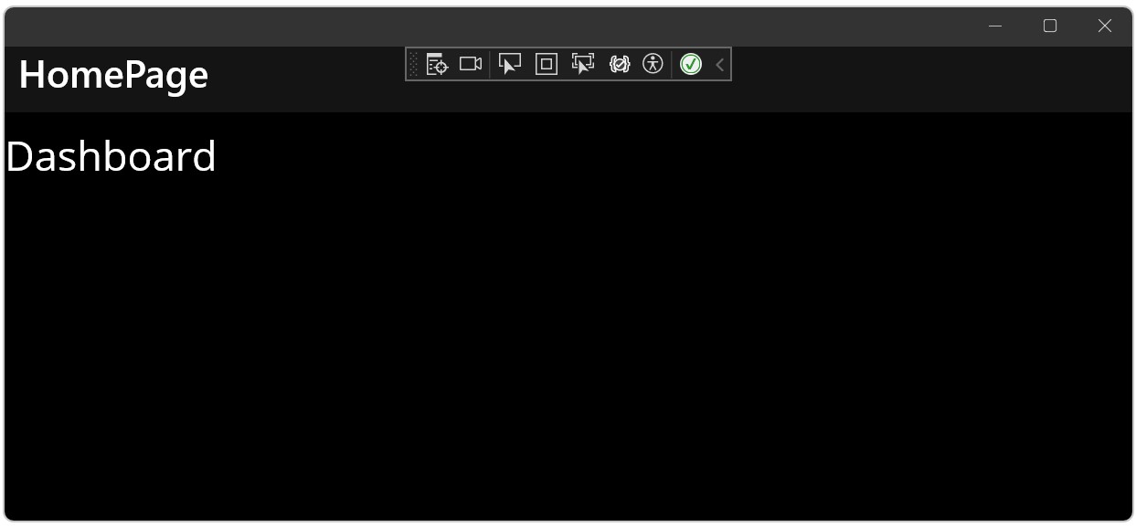
Title
Did you notice the title showing in some titlebar at the top of the application? I don’t mean the Dashboard, but the HomePage. You can easily change or remove it by changing some XAML.
Changing is pretty easy. Just open up the HomePage.xaml and change the Title in the ContentPage element. Let’s change it to The Dashboard. Run the application and voila!
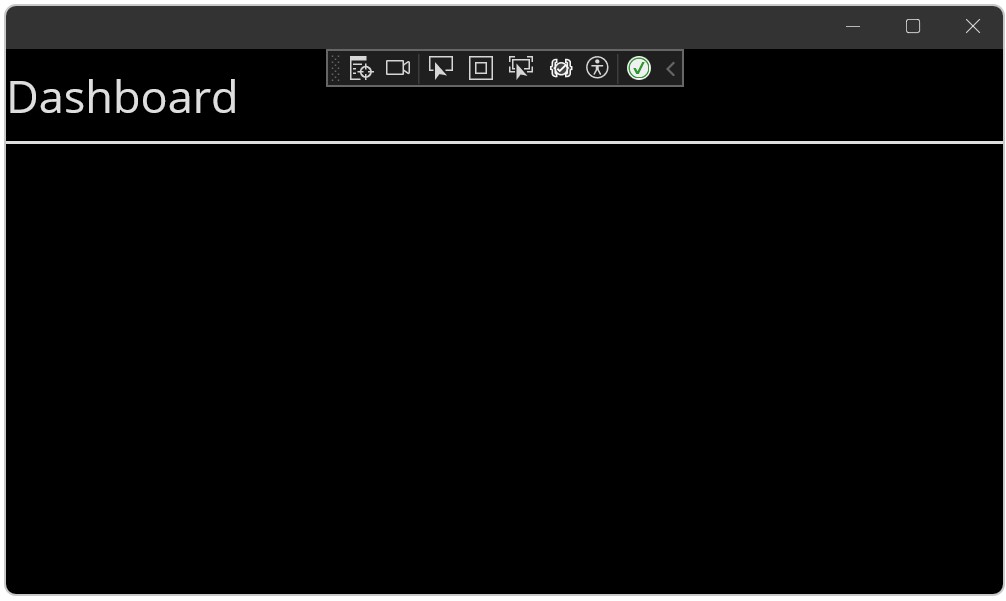
Removing it is a bit tricky since the title is defined at two locations. If you remove the attribute Title from the ContentPage, you will see that the title changes to Home. But… Why?
Do you remember changing the start-up page from MainPage to HomePage? Well, there is another Title in the ShellContent element. If you remove that one, located in the AppShell.xaml, you will get rid of the title entirely.
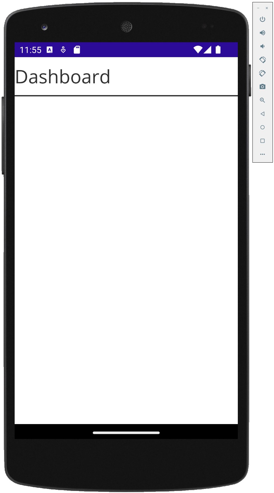
Oh, look at that! Beautiful! You can also run it in the Android emulator to check how it looks. In my emulator, Android uses the light theme.
Conclusion
In this article, I have shown you how to change the first page, that start page, and add some basic elements to the page with XAML. We didn’t really touch any C#, which is okay for mobile development. Don’t worry, C# will return shortly!
Then we looked at some basic styling. Changing the text size, adding some colors, and discussed the dark and light themes. It isn’t really rocket science. But you’ll have to start somewhere, right?
Oh, and here is the solution for the chapter Your turn! After changing the text color, your XAML of the HomePage should look like this:
<?xml version="1.0" encoding="utf-8" ?>
<ContentPage xmlns="http://schemas.microsoft.com/dotnet/2021/maui"
             xmlns:x="http://schemas.microsoft.com/winfx/2009/xaml"
             x:Class="Expenser.MAUIAppl.Pages.HomePage">

    <ContentPage.Resources>
        <Style TargetType="Label">
            <Setter Property="FontSize" Value="30" />
            <Setter Property="TextColor" Value="{AppThemeBinding Dark={StaticResource Header2}, Light={StaticResource Header1}}"/>
        </Style>

        <Style TargetType="BoxView">
            <Setter Property="Color" Value="{AppThemeBinding Dark={StaticResource Header2}, Light={StaticResource Header1}}"/>
            <Setter Property="HeightRequest" Value="2"/>
        </Style>
    </ContentPage.Resources>

    <VerticalStackLayout Margin="0,10,0,0">
        <Label Text="Dashboard" />
        <BoxView Margin="0, 10, 0, 0"/>
    </VerticalStackLayout>
</ContentPage>
